

About the Project
Audience: Restaurant Servers
Responsibilities: Instructional Design, eLearning Development, UX/UI
Tools Used: Articulate Storyline 360, SCORM Cloud, xAPI, ChatGPT
Project Type: Scenario-Based Simulation
The Problem
Professional servers make a busy dining room look effortless. They greet guests, answer questions, remember special requests, and keep multiple tables moving at once. But when several guests need something at the same time, knowing the steps of good service isn't enough. Servers have to quickly decide what needs their attention first and what can wait.
For a new server, those decisions can be difficult to learn from a list of rules or procedures alone. The real challenge isn't simply knowing what to do. It's knowing when to do it when several things are happening at once.
This created an opportunity to design training that lets new servers practice making those decisions in realistic situations, without the pressure of making their first mistakes on the restaurant floor.
The Solution
I created an interactive restaurant simulation where learners step into the role of a server during a busy shift. Instead of simply identifying the rules of good service, learners have to make decisions in the moment, choosing between competing tasks and determining which guest needs their attention first.
The experience is scaffolded across two phases. Phase 1 introduces learners to the prioritization skill with simpler scenarios, allowing them to practice making decisions and receive feedback along the way. Phase 2 increases the difficulty by introducing more challenging situations and a timer, requiring learners to make decisions more quickly as the pressure builds.
The goal was to gradually move learners from practicing the skill in a supported environment to applying it under the kind of pressure they might experience during a real restaurant rush.
Design Process
Rather than designing the simulation around a single correct response, I wanted learners to practice the judgment required to prioritize competing guest needs. Two design decisions were especially important to creating that experience.
Scenario Design
I designed the simulation around a three-table café environment to give learners multiple competing priorities to evaluate while keeping the experience easy to understand. The setting helps place learners in the role of a server and makes the decisions feel more like a real shift than a traditional knowledge check.
For each scenario, I intentionally designed at least two choices to feel important. The learner has to consider why each guest needs attention, what could happen if they wait, and which situation has the greatest impact on the dining room. This encourages learners to rely on judgment rather than looking for an obviously correct answer.
I also built learner support into the experience. A trainer character introduces the simulation, establishes the context, and provides guidance and feedback throughout the experience. A hint is available when learners need additional support, helping them move forward without immediately revealing the answer.

The three-table environment gives learners multiple competing priorities to evaluate within a realistic restaurant setting.

The trainer introduces the simulation and provides guidance as learners progress through the experience.
Each scenario branches to feedback based on the learner's specific decision. The Story View below shows how each choice leads to a corresponding feedback slide before moving the learner into the next scenario.
When a learner selects the highest-priority task, the feedback explains why that choice was the right decision. When they choose a different task, the feedback doesn't simply mark the answer incorrect. It explains why their choice may have been important, then identifies what made another task the higher priority.
This approach allows the feedback to reinforce the reasoning behind each decision rather than simply revealing the correct answer. In Phase 2, learners can also receive feedback if the timer runs out before they make a selection, creating a fourth possible outcome for each scenario.


Each learner decision branches to feedback specific to the choice they made before continuing to the next scenario.
Feedback explains the reasoning behind the learner's decision and reinforces the prioritization skill.
Feedback Design
Development
The simulation relies on Storyline variables, triggers, layers, and branching to create an experience that responds to learner decisions in real time. I used these features to build the decision-making interactions, custom countdown, feedback pathways, and performance tracking.
Building the Decision Logic
Each scenario is built with multiple interactive layers that allow learners to investigate the needs of each table before deciding where to go next. Each scenario includes three table layers, and a help layer.

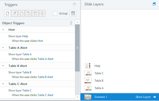
When a learner selects an exclamation point above a table, a layer opens describing what that table needs. The learner can either close the layer and consider another table or select the table as their choice. Once a decision is made, Storyline triggers the feedback screen associated with that specific choice. After receiving feedback, the learner continues to the next scenario and repeats the process. This structure allows the simulation to respond to each learner's decision while keeping the overall experience consistent and easy to navigate.


Creating Pressure
To create the time pressure in Phase 2, I built a custom countdown using Storyline variables and layer triggers rather than relying on Storyline's built-in timing features. A numeric timer variable tracks the remaining time. When the countdown layer's timeline ends, a trigger subtracts one from the timer variable and resets the countdown, creating a continuous countdown until the timer reaches zero.

The starting value is set on the base layer, allowing the countdown to be adjusted for different scenarios.
This approach gave me control over how the timer behaved and allowed me to integrate the countdown directly into the scenario logic. When the timer reaches zero, the learner receives feedback for running out of time rather than simply moving on to the next question.

Tracking Performance
I wanted the simulation to capture more than course completion, so I built performance tracking into both phases of the experience. Each phase uses its own score variable, allowing learner performance to be evaluated independently.

Separate variables track learner performance across each phase of the simulation.
Phase 1 uses the Score variable, while Phase 2 uses Score2. Learners who score 4 or higher in Phase 1 progress to Phase 2. In Phase 2, a score of 4 or higher completes the experience. A score below 4 gives the learner a chance to try the phase again from the beginning.
I also used custom xAPI statements to capture performance at both the scenario and phase level. For each scenario, the learner's selected response generates an xAPI statement indicating whether they passed or failed that scenario.

Storyline triggers update the learner's score and send the corresponding scenario result as an xAPI statement.
At the end of each phase, the learner's cumulative score is sent with a passed or failed result based on the phase performance threshold. This allows the final results to reflect both individual scenario performance and overall performance within each phase.


SCORM Cloud was used to verify that the xAPI statements were successfully transmitted and captured, including individual scenario results and final phase scores.
Accessibility
Accessibility was considered throughout the development of the simulation to make the experience usable across different ways of interacting with and receiving information.
Keyboard Navigation
The entire simulation can be navigated and completed using a keyboard without requiring a mouse. Interactive elements can be reached using the Tab key and activated with Enter, allowing learners to move through the scenarios and make selections using keyboard input.
Alternative Text
Alternative text was added to visual elements that needed additional description, helping communicate the purpose of meaningful visuals to learners using assistive technology.
Visual and Audio Options
The trainer's narration is paired with matching on-screen text, providing learners with both visual and audio access to the same information. This ensures that important instructional content is not dependent on audio alone.
Color Independence
Color is used to visually distinguish interactive options, but it is not the only way their purpose is communicated. The Close and Select buttons use contrasting colors, while their text labels clearly identify what each button does. Correct and incorrect outcomes are also communicated through text and audio narration from the trainer, rather than relying on color alone.
Accessibility was considered as part of the interaction design rather than added as a final checklist.
Testing and Iteration
This was one of the smoothest builds I've completed, with most of the iteration happening during the initial design of the simulation rather than after development.
The biggest design challenge was finding a café environment that could support the interaction I had in mind. I experimented with several different background images before settling on a layout that provided three distinct tables with enough space for the learner to identify and interact with each one.
I chose three tables intentionally. The goal was to give learners enough competing priorities to make the decision meaningful without overwhelming them with too many options. Three choices provided enough complexity to create a realistic prioritization task while keeping the interaction manageable.
Once the café environment and interaction structure were established, the development process was relatively straightforward. I tested the simulation throughout development to verify that the scenario paths, feedback, scoring, countdown, keyboard navigation, and xAPI statements behaved as intended.

Takeaways
Expanding Adaptive Scaffolding
The current simulation uses two levels of difficulty, but I would like to take the scaffolding further in a future iteration. Instead of moving every learner through the same progression, I could introduce additional scenarios and difficulty levels that respond to learner performance. Learners who demonstrate strong prioritization skills could move into more complex situations, while learners who are struggling could receive additional practice with simpler scenarios before progressing.
The dynamic feedback system already provides individualized responses based on learner decisions, so expanding the scenario structure would be a natural next step toward a more adaptive experience.
Developing a More Distinctive Visual Identity
This project also showed me an area where I want to continue growing as a visual designer. I used assets available within Articulate Storyline, including the café environment and character, which allowed me to focus on the instructional experience and interaction design.
For future projects, I would like to become more confident sourcing, creating, and adapting visual assets independently so I can develop more distinctive environments and characters that are tailored specifically to the learning experience.
What this Project Demonstrates
-
Scenario-based instructional design
-
Progressive scaffolding
-
Branching and conditional logic
-
Custom Storyline interactions
-
Accessibility-conscious development
-
xAPI implementation and LMS testing
-
Iterative design and problem-solving